Yolo Study Online Learning Platform
Yolo Study Online Learning platform
Overview
Yolo Study Online assists its customers in achieving their goals by providing an enriching online learning experience. The main objective was to enhance the user experience, introduce new digital products and boost conversion rates.
Overview
Buki is an online platform that connects private tutors with students. With 110,000+ tutors and 200+ subjects, Buki makes it easy for students and tutors to find each other.
Yolo Study Online assists its customers in achieving their goals by providing an enriching online learning experience. The main objective was to enhance the user experience, introduce new digital products and boost conversion rates.
Primary objectives
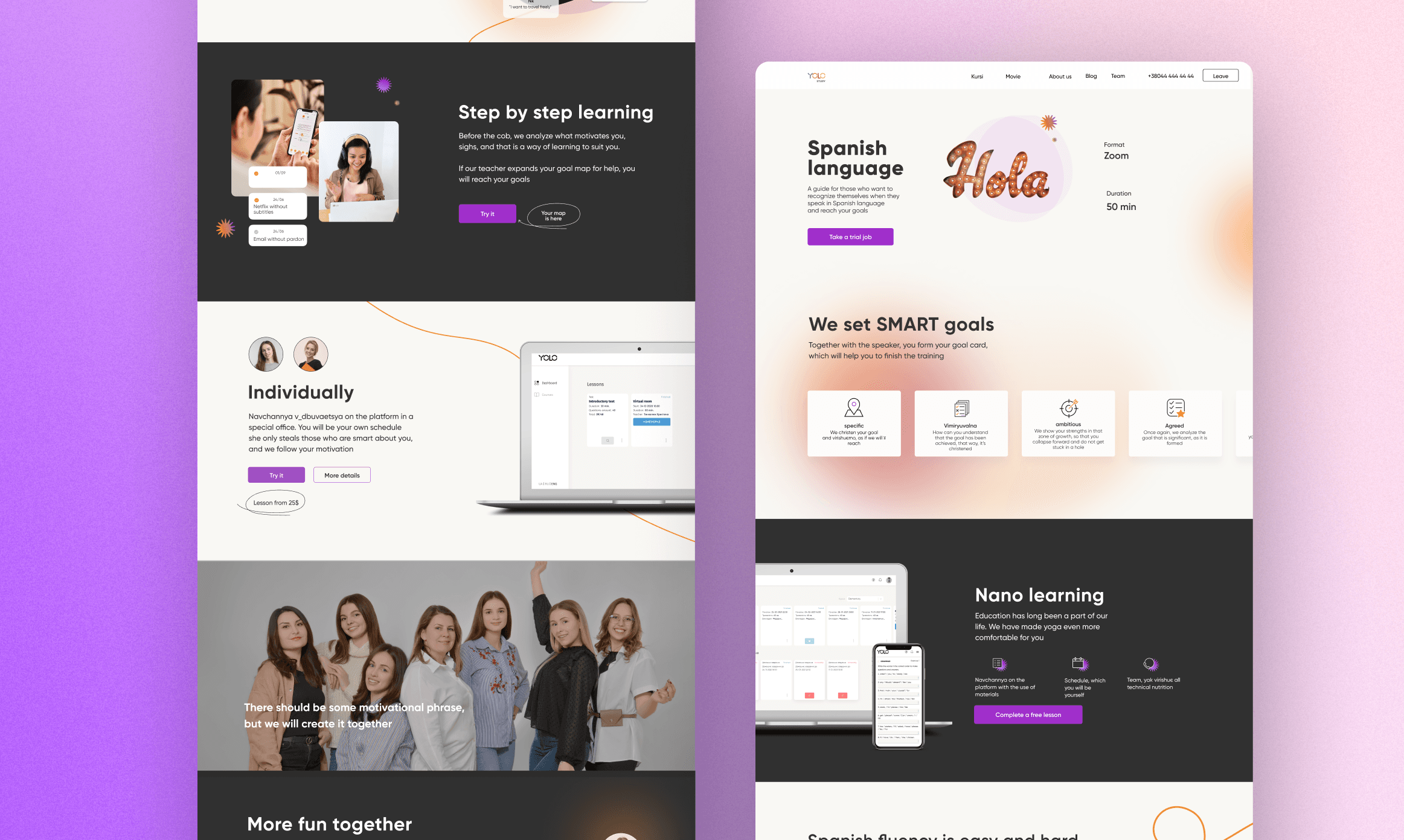
One of the key goals of this project was to revamp the existing website. This involved identifying core problem areas and proposing solutions through a redesig. The focus was on streamlining the overall user flow and introducing several new pages to enhance user engagement.
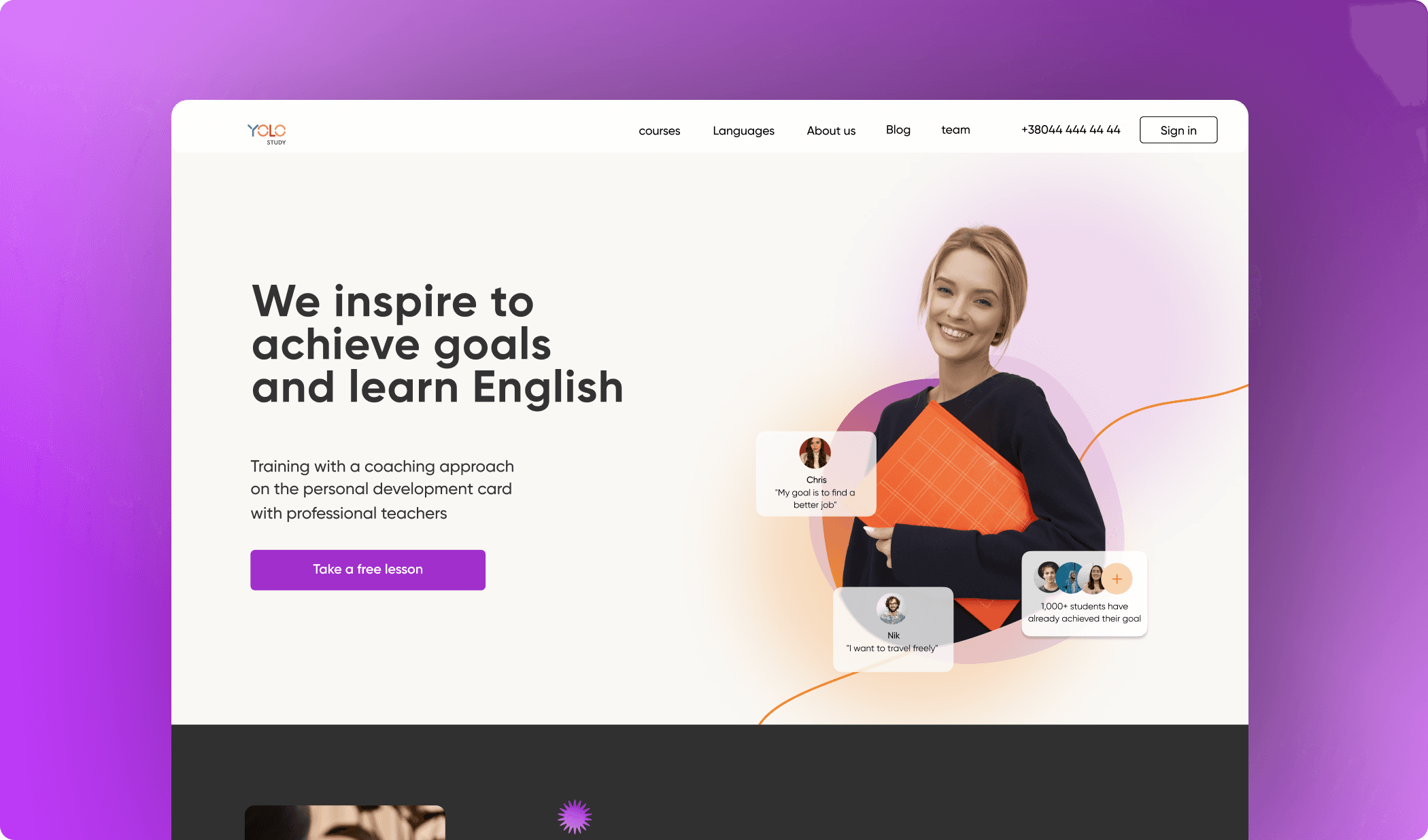
Additionally, the task was to develop a contemporary and appealing brand aesthetic, incorporating colors and patterns that resonate with a younger audience.
Improving the flow of user experience
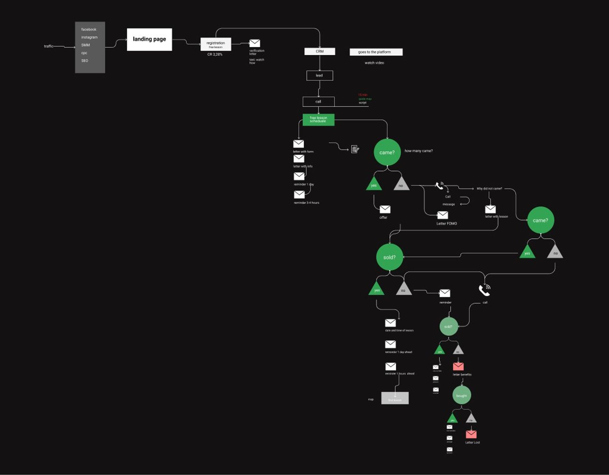
Initially, we identified the crucial metrics to gauge the success of any modifications we make in the user flow. We analyzed data from Google Analytics to determine which changes we could test. For instance, we found that sending reminders before the lesson to users increased the conversion rate by 16%.
Research
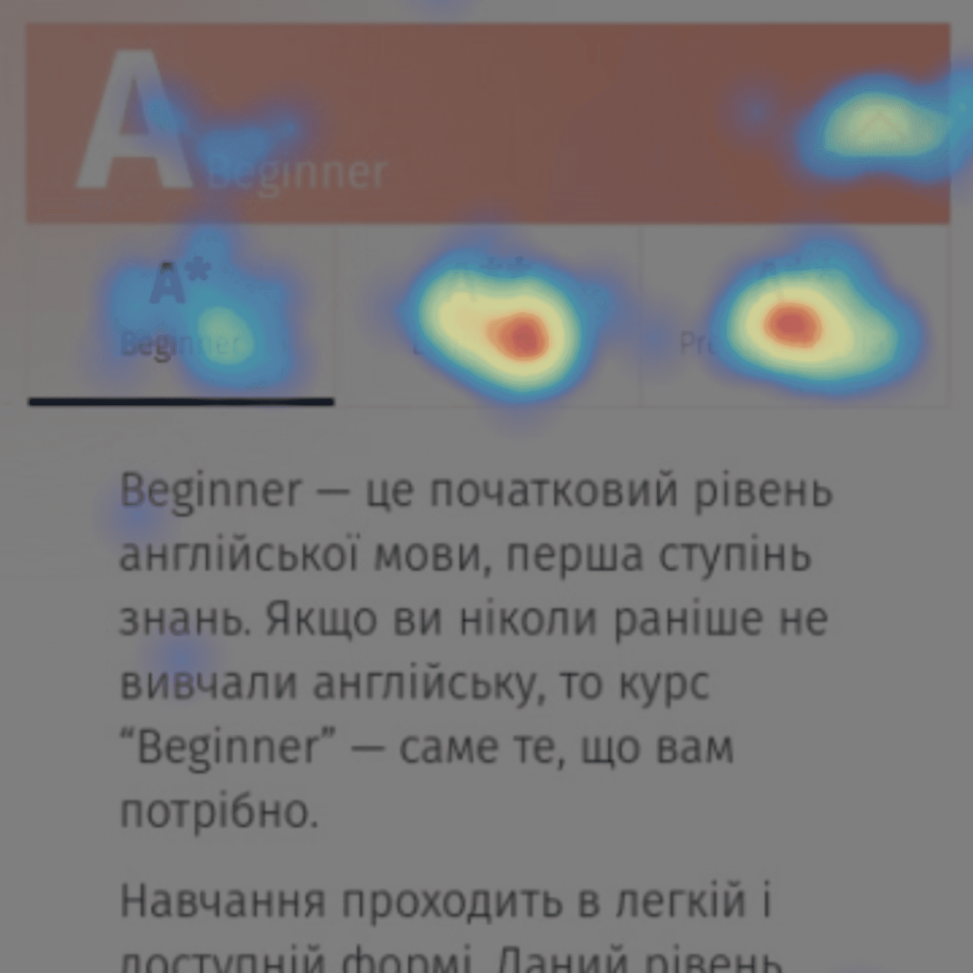
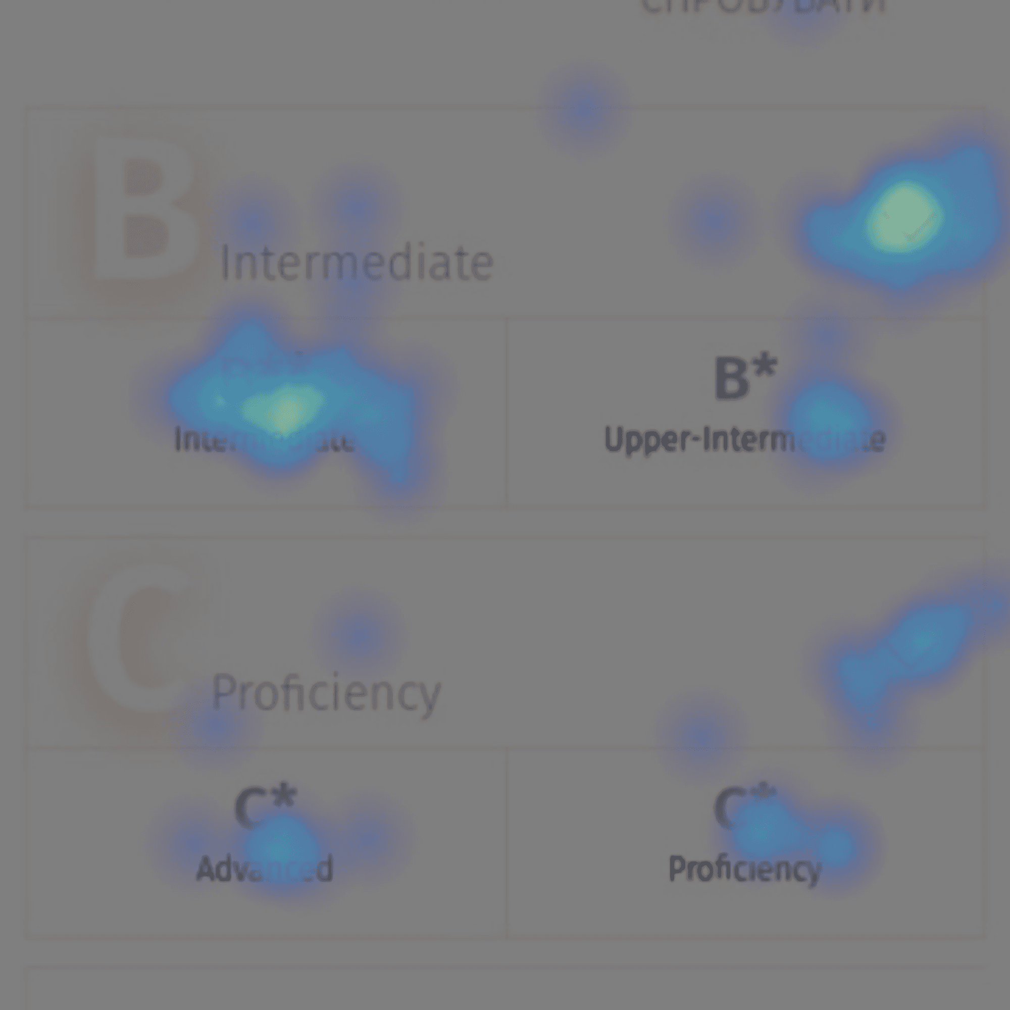
I began by conducting a heuristic evaluation to identify the major issues that could hinder users from finding what they needed on the platform. The users were feeling lost during their experience. To gather data on user behavior, I used recordings, heat maps, and Google Analytics.
Design
We decided to use photos of our tutors, as they go along the learning process together with each student. These mentors motivate along the way and help students to continue the learning process.
Next Case
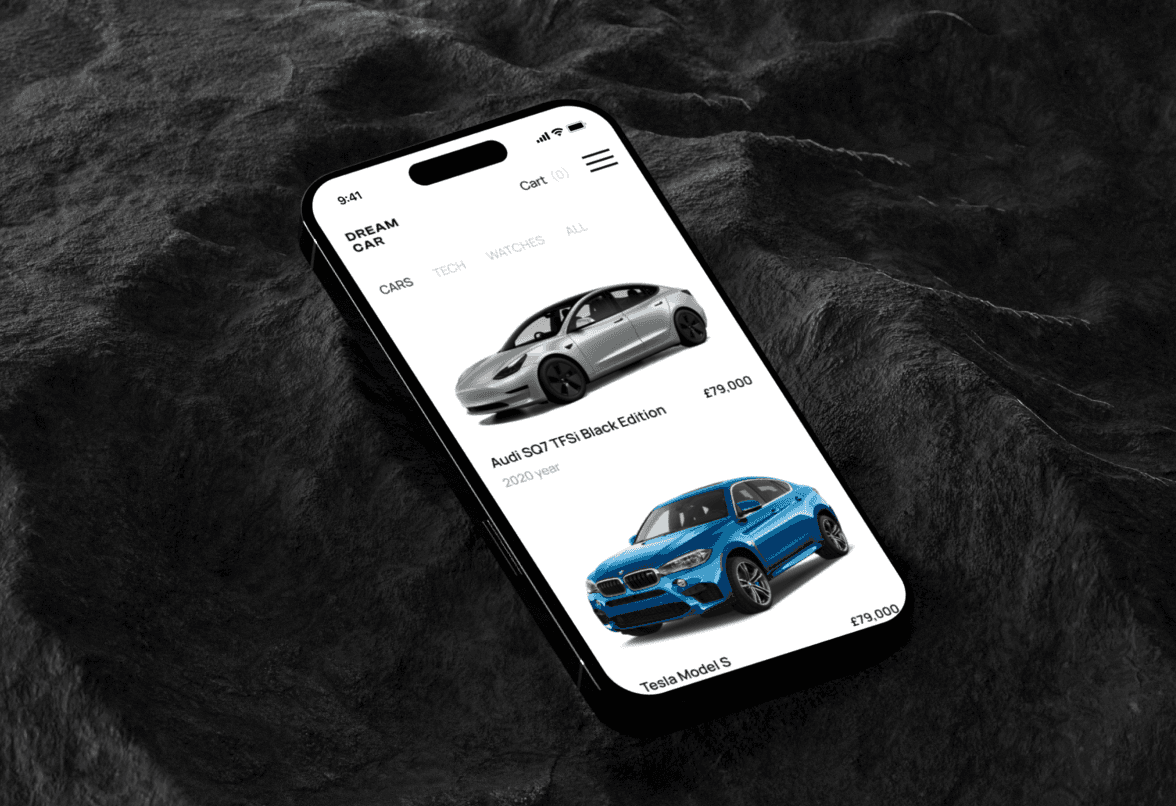
Luxury Car Resale Platform
Luxury Car Resale Platform

Balance App
Balance App
Primary objectives
One of the key goals of this project was to revamp the existing website. This involved identifying core problem areas and proposing solutions through a redesig. The focus was on streamlining the overall user flow and introducing several new pages to enhance user engagement.
Additionally, the task was to develop a contemporary and appealing brand aesthetic, incorporating colors and patterns that resonate with a younger audience.
Improving the flow of user experience
Initially, we identified the crucial metrics to gauge the success of any modifications we make in the user flow. We analyzed data from Google Analytics to determine which changes we could test. For instance, we found that sending reminders before the lesson to users increased the conversion rate by 16%.
Research
I began by conducting a heuristic evaluation to identify the major issues that could hinder users from finding what they needed on the platform. The users were feeling lost during their experience. To gather data on user behavior, I used recordings, heat maps, and Google Analytics.
Design
We decided to use photos of our tutors, as they go along the learning process together with each student. These mentors motivate along the way and help students to continue the learning process.
Next Case
Luxury Car Resale Platform
Luxury Car Resale Platform
Balance App
Balance App
Next Case
Luxury Car Resale Platform
Luxury Car Resale Platform
Balance App
Balance App